Beginner's guide · Make & create
Choose one script family.
Practise strokes before quotes.
Start with broad-edge italic calligraphy, a beginner fountain-pen set and ruled practice paper. Calligraphy builds letters stroke by stroke; ordinary handwriting quality matters far less than nib angle, consistent height and patient repetition.
Quick answer
Choose one script family.
Pick broad-edge italic rather than mixing it with pointed-pen copperplate or brush lettering. Use the middle-width nib from a Manuscript beginner set, rule an x-height of about five nib widths and practise straight, branching and oval strokes before combining them into lowercase letters.
- 01
Broad-edge and pointed-pen calligraphy produce contrast in different ways. Buy for one route, not a vague box that claims to teach every style at once.
- 02
A cartridge fountain calligraphy pen removes the first complications of dip depth and ink preparation while preserving the chisel edge lesson.
- 03
Smooth bleed-resistant practice paper prevents feathering from disguising stroke shape.
- 04
Ten careful repeated strokes reveal more than one ambitious quotation written before spacing and letter construction are understood.
What to expect
What the first attempts really involve
The first project is useful because it exposes the decisions that shopping pages tend to hide.
Construction
Formal letters are assembled from strokes. Attractive everyday handwriting does not automatically create correct italic forms, and poor handwriting is not a barrier.
Guidelines
Baseline, x-height, ascender, descender and slant keep practice comparable. Unruled decorative paper hides which proportion drifted.
Nib angle
The broad edge must stay at a steady angle to create predictable thick and thin strokes. Rotating the wrist changes the whole texture.
Rhythm
Spacing between letters is optical as well as measured. It develops after individual forms stop demanding all the attention.
Ink and paper
A good pen can feather on absorbent paper, while unsuitable ink can clog a fountain pen. Match the system rather than blaming hand control.
Fundamentals
Build the first attempt on reliable fundamentals
Commit to broad-edge italic first
Italic uses a broad chisel edge held at a consistent angle. Copperplate and many modern scripts use a flexible pointed nib with pressure-based swells. They share discipline but not the same pen movement, so keep the first month coherent and explore pointed pen only when its letterforms are the actual attraction.
Rule the practice page
Use the guide supplied with the pad or draw a baseline, x-height, ascender and descender. A common beginner italic x-height is roughly four or five nib widths, but follow the chosen manual. Write the nib size and date on every sheet so changes are comparable.
Build a short repeatable drill
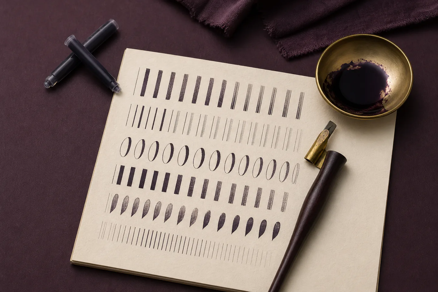
Warm up with parallel downstrokes, joins and oval families while keeping the pen edge at the chosen angle. Practise for twenty focused minutes, circle the most consistent example and write one note for the next session. Stop before fatigue turns every line into a grip problem.
Starter products
A broad-edge set and paper that shows the real stroke
The Manuscript Deluxe set is the direct broad-edge route and the bleed-resistant paper supports drills. The Leonardt copperplate set is deliberately placed as an alternative later route—do not buy both until the visual difference is understood.
Manuscript MC1155LA Deluxe Calligraphy Set
It preserves the chisel-edge stroke lesson without adding loose ink bottles and nib loading to the first practice session.
Manuscript Calligraphy Paper, 36 sheets, 90 gsm
A reliable surface lets nib angle and letter construction be judged instead of confusing paper bleed with poor hand control.
First lettering
Write one balanced italic name card
Complete at least two pages of basic strokes and lowercase families before using the best practice to make a small folded name card.
- 01
Choose the middle nib
Fit one broad nib and its correct cartridge according to the manufacturer instructions. Keep the smaller nibs boxed.
- 02
Prepare the flow
Start the pen on scrap practice paper without pressing or shaking. If flow is poor, use only the maker's cleaning and starting method.
- 03
Rule the guidelines
Set baseline and x-height from the manual, then add ascender and descender lines with a hard pencil and light pressure.
- 04
Warm up
Fill one row each with parallel strokes, branching strokes and ovals, keeping the nib angle fixed.
- 05
Practise letter families
Group letters by shared construction rather than alphabet order. Write slowly and lift the pen where the model shows a new stroke.
- 06
Test the name
Write the intended short name or word several times, paying attention to the spaces between forms rather than adding flourishes.
- 07
Prepare the card
Fold a good sheet or use a blank, rule very light guidelines and mark the horizontal centre.
- 08
Write once
Use the most comfortable practice version, let the ink dry fully and erase pencil only when the paper and ink can safely tolerate it.
- 09
Record the setup
Note nib width, ink, paper and x-height on the back or in a practice log so a successful combination can be repeated.
Troubleshooting
Read the result before buying another tool
Feathering is often the paper
Test the same pen on the dedicated practice pad before changing pressure or ink. Fountain-pen calligraphy ink must be compatible with the pen; dense dip-pen ink can clog a cartridge system.
Uneven contrast points to nib rotation
Draw slow parallel ladders and watch the flat edge, not the letter. Relax the grip and move more from the forearm so the pen does not twist through a curve.
Crowded words need spacing practice
Cut out good individual letters and move them visually, or write pairs repeatedly. Flourishes add more spacing decisions and should wait until the plain word breathes.
Skip for now
What can wait
A coherent script, pen and paper combination builds skill faster than a decorative gift box.
- 01
Pointed-pen supplies
Copperplate needs a flexible nib, holder, compatible ink and pressure control. Add that system only if pointed forms are the intended next script.
- 02
Large ink collections
One reliable black ink shows stroke edges clearly. Metallic and waterproof inks introduce settling, cleaning and paper-compatibility problems.
- 03
Flourishing manuals
A flourish magnifies spacing, pen angle and planning. Plain balanced words should arrive first.
- 04
Expensive handmade paper
Use consistent practice stock until the pen and ink combination is reliable. Decorative paper can be tested for a final piece later.
Upgrade path
What a better setup changes
The path moves from a low-maintenance broad-edge pen to dip nibs and specialist scripts only when the desired letterform demands them.
Broad-edge foundations
About £15–£25Beginner fountain set + ruled practice paper
Teaches angle, x-height, stroke families and spacing with simple ink handling.Broad-edge dip pen
Add £10–£30Holder + selected broad nib + compatible ink
Offers different edge qualities and colours while adding nib preparation and loading.Pointed pen
Add £20–£50Nikko G-style nib + suitable holder + ink + smooth paper
Creates pressure-based swells for copperplate and related scripts as a separate system.Safety
Work safely from the first attempt
Ink, sharp nibs and repeated posture are the practical risks in an otherwise quiet desk hobby.
- Keep nib points capped or boxed and never press a reluctant fountain nib into the paper.
- Use only ink approved for the pen type; do not put dip-pen or acrylic ink into a fountain pen unless the manufacturer explicitly permits it.
- Close ink, protect clothes and keep the bottle away from the working hand and page edge.
- Take short breaks, loosen the grip and adjust chair and paper angle before hand, wrist or shoulder discomfort builds.
- Keep ink and detachable nibs away from children and pets, and wash skin according to product guidance.
Classes
When outside help is useful
A class is valuable when a tutor can correct nib angle and letter construction in real time, but self-directed drills are enough to begin.
A short italic workshop should teach pen setup, basic strokes, x-height and a small alphabet family.
A full day or feedback course is useful for complete lowercase, capitals, spacing and an applied card or quotation.
Representative UK accredited-tutor and online italic formats checked 30 July 2026; materials and feedback differ.
Sources
Sources and checking notes
Manuscript provides pen and nib preparation guidance, recognised calligraphy organisations define the discipline and community advice reinforces choosing one script route.
-
01
Manuscript · Prepare a dip nib
Manufacturer method for cleaning and preparing Leonardt dip nibs.
Open source -
02
Manuscript · Multiple scripts
Tool choice for italic and blackletter examples.
Open source -
03
Society of Scribes and Illuminators
UK calligraphy organisation and broad-edge tradition.
Open source -
04
r/Calligraphy · Where to start
Current discussion separating broad-edge, pointed pen and modern routes.
Open source -
05
Amazon UK · Manuscript Deluxe set
Exact beginner broad-edge set checked for current UK availability.
Open source -
06
Amazon UK · Manuscript calligraphy paper
Exact 36-sheet bleed-resistant paper checked for current UK availability.
Open source -
07
Amazon UK · Manuscript practice pad
Exact guided practice pad checked for comparison.
Open source -
08
Amazon UK · Leonardt copperplate set
Exact pointed-pen alternative checked for later comparison.
Open source
Guide information and links checked 30 July 2026.